When less really is more by Uta Abendroth | 2nd March, 2018 | Offices
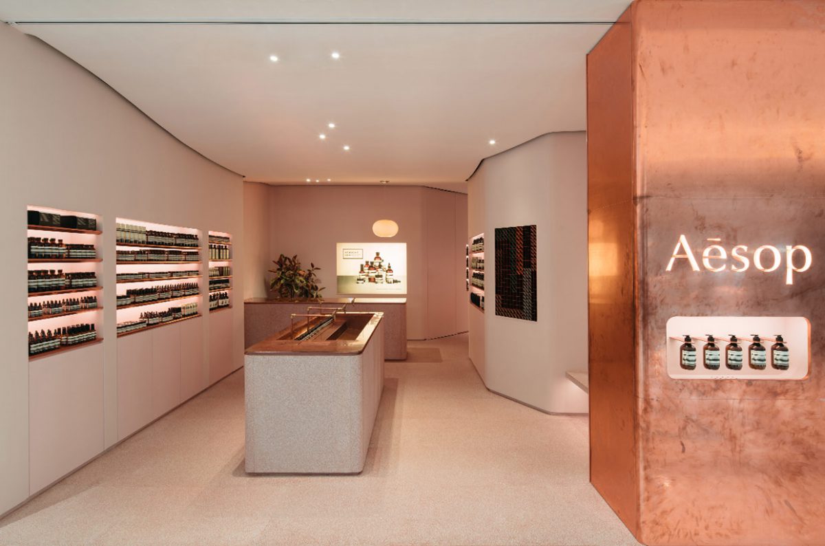
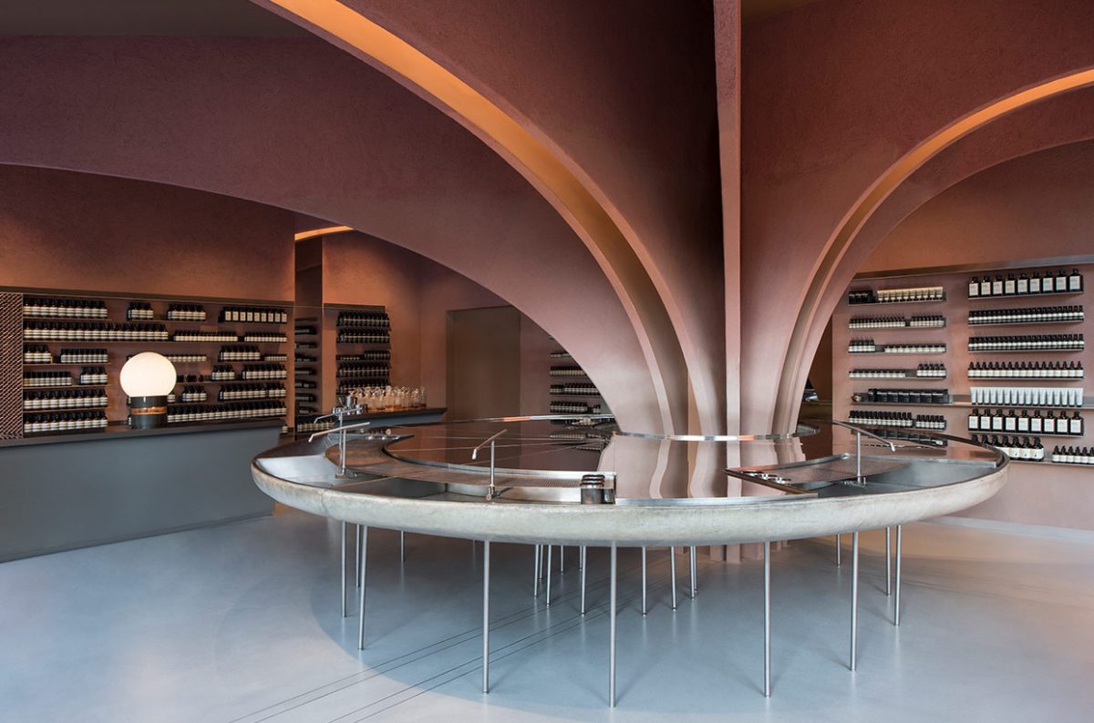
Minimalist packaging, no advertising, but nevertheless highly recognizable: the Australian cosmetics brand Aesop has opened more than 100 shops in cities like Kuala Lumpur, Kyoto, Cologne, Melbourne, Macau and Milan. Each store has been designed by a different architect or design studio. The concept: total emersion in the atmosphere of each respective location.
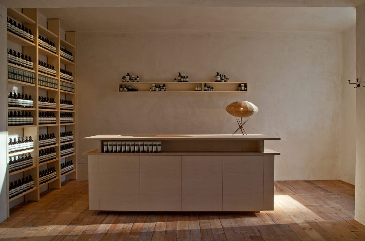
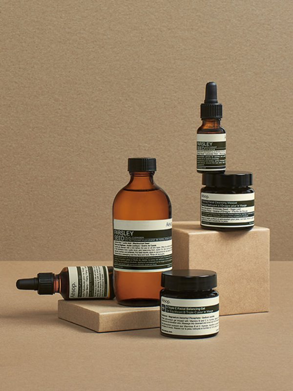
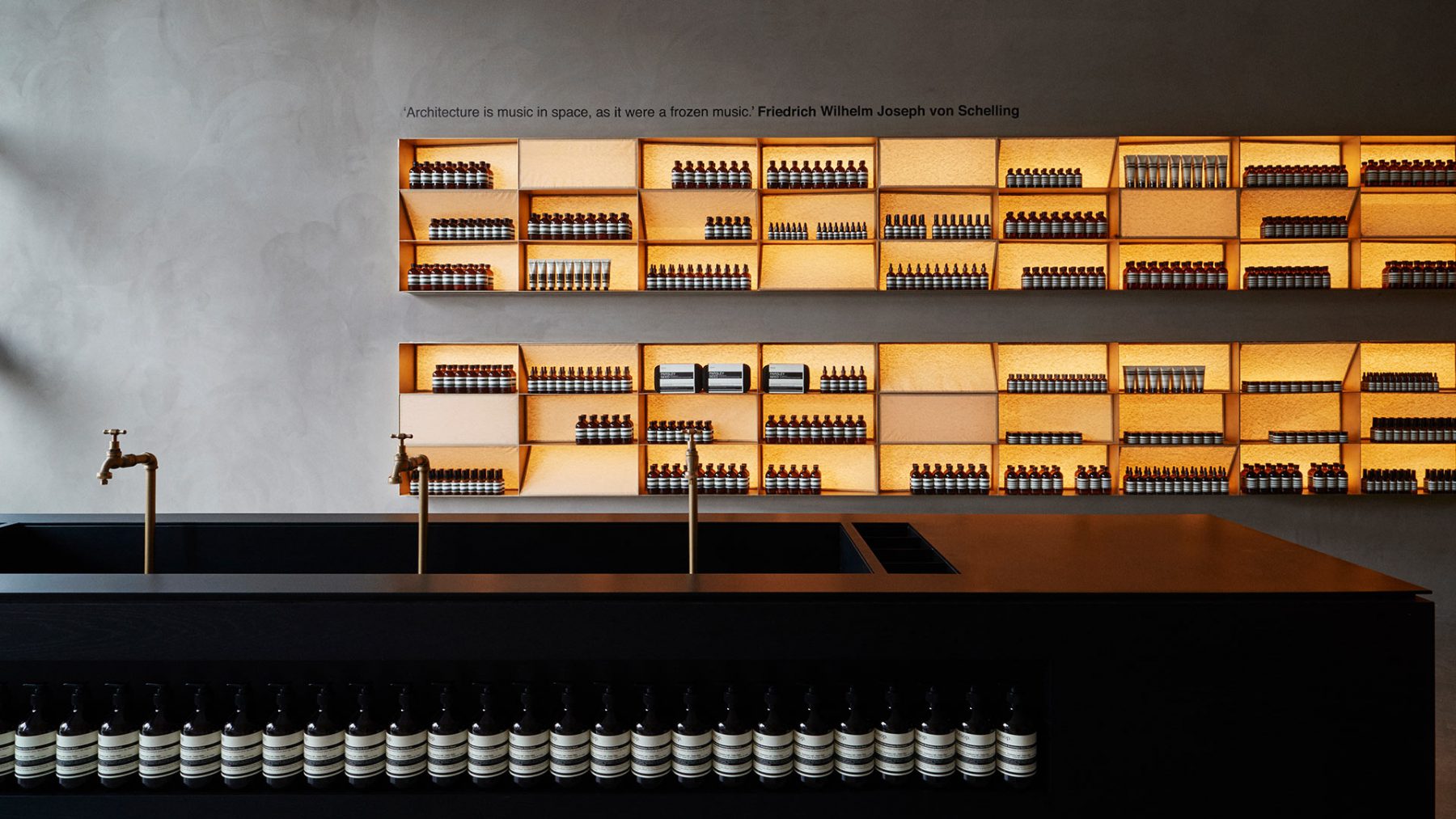
In the Aesop store in Singapore countless coir (coconut) fibers hang down from the ceiling. Staff also use the thin strings to gift wrap people’s purchases. In fact, an impressive 30 kilometers of coir has been suspended from the ceiling by the March design studio. The ensemble looks like a meadow of dried grass turned upside down and creates a unique effect: The slightest amount of airflow sets the cords in motion. In the Aesop branch located in the Paris neighborhood of Le Marais, architecture firm Ciguë 427 has made use of the steel caps that normally seal the sewer pipes in the French capital. Blackened or polished, they now adorn the walls of the store and function as shelving units for the beauty products. The larger ones are used as sinks. In New York City on the other hand, architect Jeremy Barbour created a store near the Bowery that is as sustainable as it is ingenious. Old editions of the New York Times form the walls and sales counters – a reference to the written word and to the special qualities recycled paper brings to architecture. You could carry on describing the witty, creatively designed stores ad infinitum. So far, the Australian beauty product brand has designed more than 100 locations in Australia, Asia, Europe and the United States and plans to add approximately 40 further locations every year. As is the case with every global corporation, there is a recognition factor, which is, however, mostly limited to the packaging of the hair and body care products. The brown bottles, small dropper bottles and glass jars boast an old-school apothecary look. Their color is designed to protect the contents from the light. There are also minimalist tubes in creamy-white, muted orange, pale blue and earthy green hues. The black-and-white labels are skillfully designed and feature quotes by Marcel Proust (“The features on our faces are hardly more than gestures which have become permanent”); Salvador Pániker (“Better than a facelift, to stay young we need to be permanently in a state of intellectual curiosity”); and Joseph Joubert (“Genius begins great works; labor alone finishes them”). These philosophical maxims are a nod to the label’s namesake, the Greek poet Aesop, who is thought to have lived in the 6th century BCE.
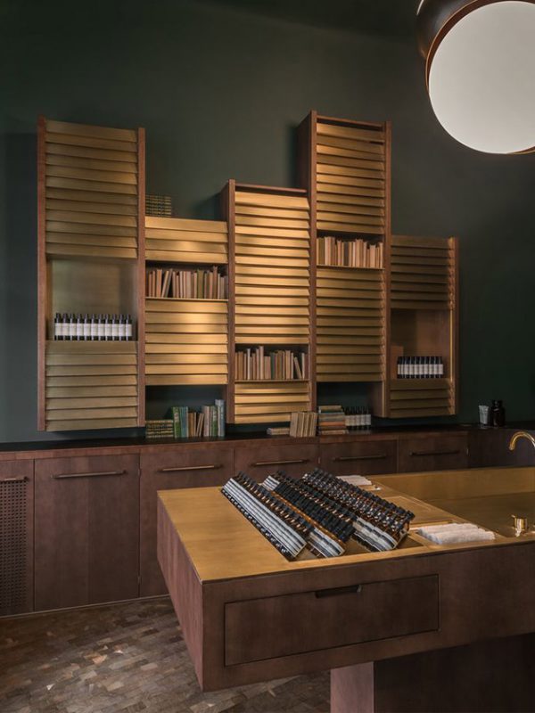
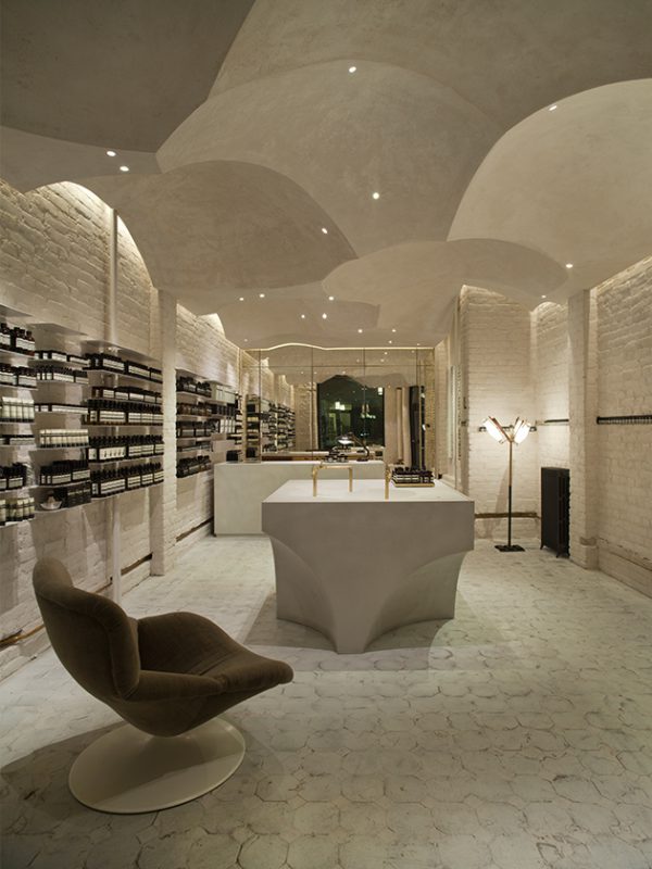
The Aesop cosmetics label was founded by Dennis Paphitis in Melbourne, Australia, in 1987. At the time, Paphitis – the scion of a family of hairdressers and barbers who originally hailed from Greece – began adding fragrant oils to the hair dyes used at his Armadale salon to attenuate the strong smell of ammonia. He then started collaborating with a chemist in order to develop a complete range of products. It does sometimes take the company four to five years to launch a new item, but it will then be around for the long run, as the product lines hardly ever change. Because of this, there is all the more emphasis put on making the stores diverse and on fostering a culture of making shopping an experience. Aesop does its utmost not to be perceived as a soulless chain store spreading an arbitrarily chosen corporate identity around the world. Rather, each store is a small architectural jewel very often designed by internationally sought-after architects or hip designers from the respective locations, like Philipp Mainzer in Frankfurt, Snøhetta in Oslo and CJ Studio in Taipei. And of course, the respective stores are featured in the germane design magazines shortly after they open; no trendy guidebook would miss them out. The stores have a cult following to the extent that enthusiasts can even look up indepth information about the design concepts on a dedicated website (www.taxonomyofdesign.com). The site also features information about the designers, the furniture, the materials used and any other relevant details that might of interest. The creatives themselves are enthusiastic about their work, like Hannah Plumb of the JamesPlumb studio that designed the store in London’s Bloomsbury neighborhood, in collaboration with her business partner. “When we worked with Aesop, we found that briefings can be short, clear and to the point. They give designers like us a lot of freedom and allow us to indulge our most experimental and exciting ideas.” That is why the highlight of the store on Lamb’s Conduit Street is the water that flows through pipes and down the levels of shelves. “They didn’t even bat an eyelid when we suggested it, although it was quite a bold idea,” says Plumb.”
Every Aesop store has as its centerpiece a sink, which can be made of a wide variety of materials: In Brisbane it is made of fiberglass; the Geneva store boasts a copper sink; in Munich it’s concrete and marble; and in Portland, Oregon, there is a vintage model made of iron and porcelain. This, in combination with the characteristic scents of essential oils, constitutes the most recognizable feature of the brand. People don’t just wash their hands here; Aesop associates also demonstrate the products to clients. They lather, rinse, oil and moisturize. The products themselves consist partly of plant-based ingredients and partly of components produced in the company’s own laboratories. (However, additives like parabens, silicone and coloring agents have been completely dispensed with.) The uniform jars, bottles and tubes, which are lined up neatly thanks to the uniquely and specifically designed shelves, look like they are part of an artistic production rather than the actual products being sold. For the last 30 years, the brand has been shaking up the market to a considerable extent. Kate Forbes, who is responsible for R&D at Aesop’s headquarters in Melbourne, sums up its philosophy using three terms: simplicity, integrity and authenticity. Their common denominator is a tendency towards minimalism, she says. For the products this has meant that heavy scents are a no-no. Rather, it’s all about natural aromas that could have come from granny’s herb garden: cloves, aniseed, sage and parsley, as well as geraniums, grapefruit, lemons, tangerines and sesame. The stores are deliberately understated and have dispensed with superfluous gimmicks. They are dominated by clear lines and soft, natural colors coupled with typical local hues. A beautiful example of this is the store in on Kaiserplatz square in Frankfurt. There, Philipp Mainzer installed backlit, dark-green shelves, which he says were inspired by German forests. Add to that the matt gray ceramic tiles, which reference the look of a traditional Hessian stone jug, as well as wired glass, which is typical of modern Frankfurt architecture. This design concept would not have worked anywhere else. Company founder Dennis Paphitis once described the experience of an Aesop store like this: “I like to compare the different stores to old-style charm bracelets. There is one band that the individual pieces are all attached to.”