Vibrant vibe by Silke Bender | 3rd June, 2022 | Personalities
With her playful palette, India Mahdavi makes the world a brighter place. If there’s one thing the internationally renowned architect and designer is sure of, it’s that colors have the power to make us happier.
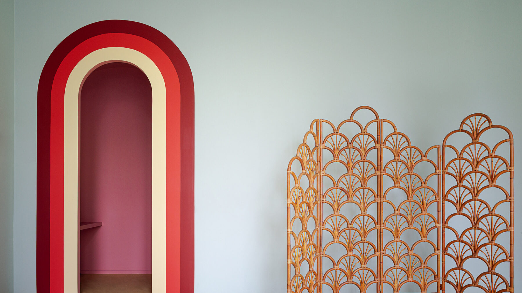
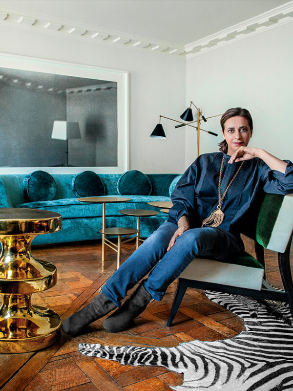
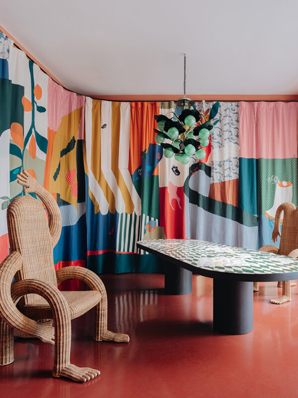
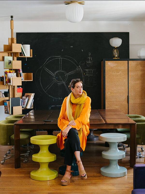
Her style is the opposite of Bauhaus. For more than 20 years, India Mahdavi has been using unusual color effects, a touch of humor and a passion for ornamentation to transform interiors into joyful, choreographed spaces. Today, she is regarded as something of a superstar. Silke Bender met the French-Iranian architect and designer in Paris, where she lives and works.
What’s the color of your mood today?
I just got back from London, where I was redesigning the new Sketch Gallery in these new, very warm colors, and that’s how I feel. I still feel the glow of Sketch: gold, yellow and champagne. But I could also answer that I feel blue and yellow because of Ukraine: the new colors for freedom and peace.
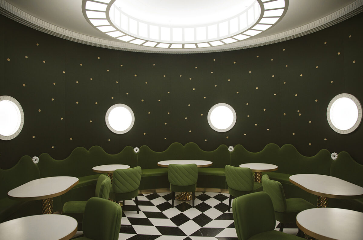
The Sketch Gallery’s famous pink interior is gone. What can you tell us about the new atmosphere that you’ve created?
The pink was so strong, I didn’t want to say: Oh, I’m just redoing it in another color. So I began working with the African artist Yinka Shonibari on different textures: the beautiful Senegalese fabrics produced by famous textile designer Aissa Dione, the woven wall lights by Inès Bressand from Ghana, the shining metal wallpaper from Gournay that reflects the light in a champagne color, the natural raffia and wicker details – and the ceiling painted in my color, Mandarine au lait. The overall result of these textures and yellow tones is warmth. Warmth is the new color of Sketch. It’s about togetherness, the joy of touching. It’s more about being human, less about the image.
Was it hard for you to say good-bye to one of your most iconic and most Instagrammed interior designs?
It was a bit difficult in the beginning, but I now feel very comfortable with it because thetiming was perfect. The pink room belonged to pre-COVID times. Now we’re in a new era. Before COVID, the world, our minds, were lighter. The pandemic closed a chapter and we all entered into this digital kind of life. We were not able to be together, and we were sharing our lives through screens. The pink room was a fantastic space but a lot of its success was also all about its image in social media. I think the experience of touching and texture, and the joy of being together, have become more important now.
But there’s another way in which the old Sketch is still present…
The whole idea of Sketch was that the interior changes every two or three years. The pink room remained for seven years because it was so successful. And because it was such an iconic room, I made a volumetric miniature of it. The model, at a scale of 1:10, is present right now in the restaurant. It’s a way of preserving the old space. It’s an archive and an object in it’s own right, and you can actually still enter it with your camera. It’s beautiful and fun!
Why do you sometimes work with mass market brands such as Monoprix or H&M?
In working with H&M, I saw an opportunity to democratize my work, to break the boundaries between high- and low-end markets. Breaking down barriers is what I brought to this profession – bouncing from one discipline to another. With this collection, H&M has offered me the opportunity to spread a joyful palette of colors on an international scale.
What’s behind the blurred chessboard pattern in the H&M Home collection?
The collection was conceived during the pandemic like a wind of needed optimism in a world of uncertainty, thus the out-of-focusgraphic elements and blurry colors melting into each other.
How often do you give the interior of your own home a makeover?
Not often enough (she laughs). I’ve been living in my home for 25 years because it’s just around the corner from my office. Recently, I renovated a huge part of the apartment and it felt like moving, but now I feel that I should really move somewhere else. I bought a big house in Arles that I have been working on for two years to make it my new space. Therefore, I would like to scale down in Paris and have something a bit smaller and more concentrated.
What style and what colors predominate in your Paris home?
It’s not that colorful, it’s more quiet. It’s a home that evolved more naturally as the layers of my life were added, one after the other. Colors come mostly from my artworks on the walls. My bedroom is in off-pink, the kitchen is colorful, yes. The furniture is a mixture of my prototypes and objects by Ettore Sottsass or Gio Ponti, mostly Italian designers. But I’ve put a lot of colors into my new house in Arles!
You are known for creating interiors that make people feel good. Are you a happy person by nature or do you use color as a form of therapy?
My attraction to color has always been within me. And it’s something that I’ve always enjoyed doing: playing with colors in a very natural way. So for a long time, I didn’t even realize it had anything to do with talent. I often dress in dark blue because I need to be in a neutral position to be able to juggle colors all day long. Colors came to me during my childhood years in the U.S. where I first watched color TV: the cartoons of Walt Disney or Tex Avery. The mid-60s in America were really crazy when it came to colors. Just think about the Hollywood movies in Technicolor! And my father liked to show me books about hishomeland Iran, and I was deeply impressed by the colorful mosque of Esfahan. Consciously or unconsciously, colors became the material of my emotions.
Can colors make us happier?
Definitely! They give us energy and have a strong impact on our mood. I really believe that the environment we live in affects the way we feel in an important way.
What are the ingredients of a joyful interior?
View colors as your friends. And don’t be scared of mixing them. Think about your home as a dinner party: It might be boring if you just invite people of the same age and profession. Also invite foreigners who have new stories to tell and get more interesting conversations started.
Is there a color combination that you would never use?
I would never say never, because color never comes alone. It depends on materials and textures and is always part of a context. I could tell you that I’m not crazy about very contrasting colors, like black and yellow. But I love them on a bee. So, no rules. Stay open-minded.
You worked for seven years with Christian Liaigre – the French master of sleek and contemporary French style who focused on neutral tones. What made you f lip your style 180 degrees when you founded your own agency in 1999?
I don’t think I changed my style. When I was working for Christian, I adopted his vocabulary. It was all about proportions, about a certain richness of materials, because he had this obsession with beautiful natural materials, and crafts. It was very easy for me to adopt that language. I remember though, that I was always the one adding color (she laughs). But he always said that he only does what he knows how to do. When I struck out on my own, I did exactly the same. And I was lucky that my first project was the Townhouse Hotel in Miami.
Why?
Miami is such a different environment: “Sea, Sex and Sun.” How to express that in three dimensions? So I started playing around with all the spectrums of colors. This was very unusual at that time and gave the hotel a very strong identity. The roof terrace, for example, was all in red, with waterbeds. It was often photographed because it was so photogenic.
That was the first of a number of hotels, the last was the L’Apogée in Courchevel, completed in 2013. What made you stop doing hotel interiors?
When I started in 2000, the hotel business was very interesting for designers. There was this new idea of finding home away from home and connecting people all over the planet. Then it became an industry. Most of the offers I received left me no freedom whatsoever. Everything was already planned down to the last detail, and they just wanted me to do the colors and brand the hotel with my name. But I am an architect and a designer, I can’t just decorate something. Luckily, I’m in a position today to be able to take on only projects that I am really passionate about.
You spent a year living in Germany. How did that influence you?
We came to Europe in May 1968 and wanted to live in Paris. But there was chaos because of the student revolt, and we ended up in Heidelberg. My life went from Technicolor to black and white. Everything was gray to me, the sky, the buildings, the people. I had the trauma of losing colors. I have this memory of walking down the shopping street with my father, like in a black-and-white movie, and suddenly, I see a pair of bright-orange shoes that were all shiny and glowing in the window, and my father bought them for me. Then we moved to the south of France and the sun came back.
Were you never drawn to Bauhaus or inspired by its ideas like so many other interior designers?
I really love Bauhaus. It was a fantastic movement! Conceptual and radical – that’s fabulous. To think that way and to go to that extreme – I guess I’m just not able to do it. I’m not precise enough. My background is different, it’s more cinematographic: I want to be more like a filmmaker, telling stories, putting characters into my creations and developing a plot.
Can you give an example?
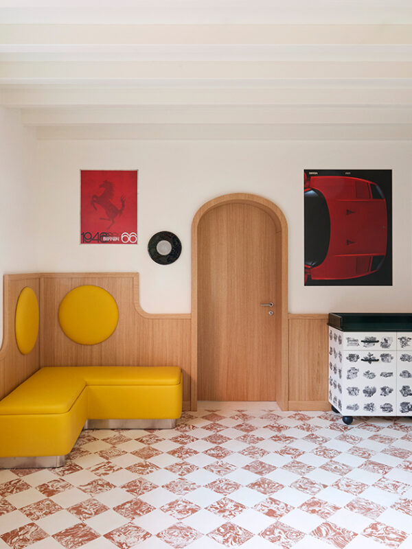
When Ladurée asked me to design its interiors, I said: Look, you have a muse, Marie- Antoinette. Versailles. Think about the beautiful garden of Versailles. Imagine Ladurée like a garden of sweetness. What would happen to Marie-Antoinette if you took her to Geneva, Beverly Hills or Tokyo? Then I started creating and everything came together: the colors, the shapes – like the round, macaron- like lamps.
Is designing private homes any different?
Of course. For residences, my work is more about portraiture. You have to think more like a photographer. You have to capture the identity of the people. Help them to find themselves at ease, in the best light and angle. I don’t like overdoing homes because people should still be able to take possession of their places afterwards. In public spaces, where people spend just a few hours, I like to express myself more boldly. In people’s homes, I don’t want to be too present.
Is there a project or an assignment that you still dream of completing?
There are several: I would love to design a train, work with mobility. A car could be interesting as well. And I would like to shoot a movie, a big story in big pictures. The last one that blew me away was “The Last Duel” directed by Ridley Scott.

Mit dem Laden des Videos akzeptieren Sie die Datenschutzerklärung von YouTube.
Mehr erfahren